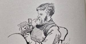
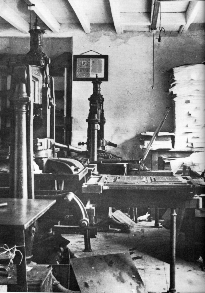
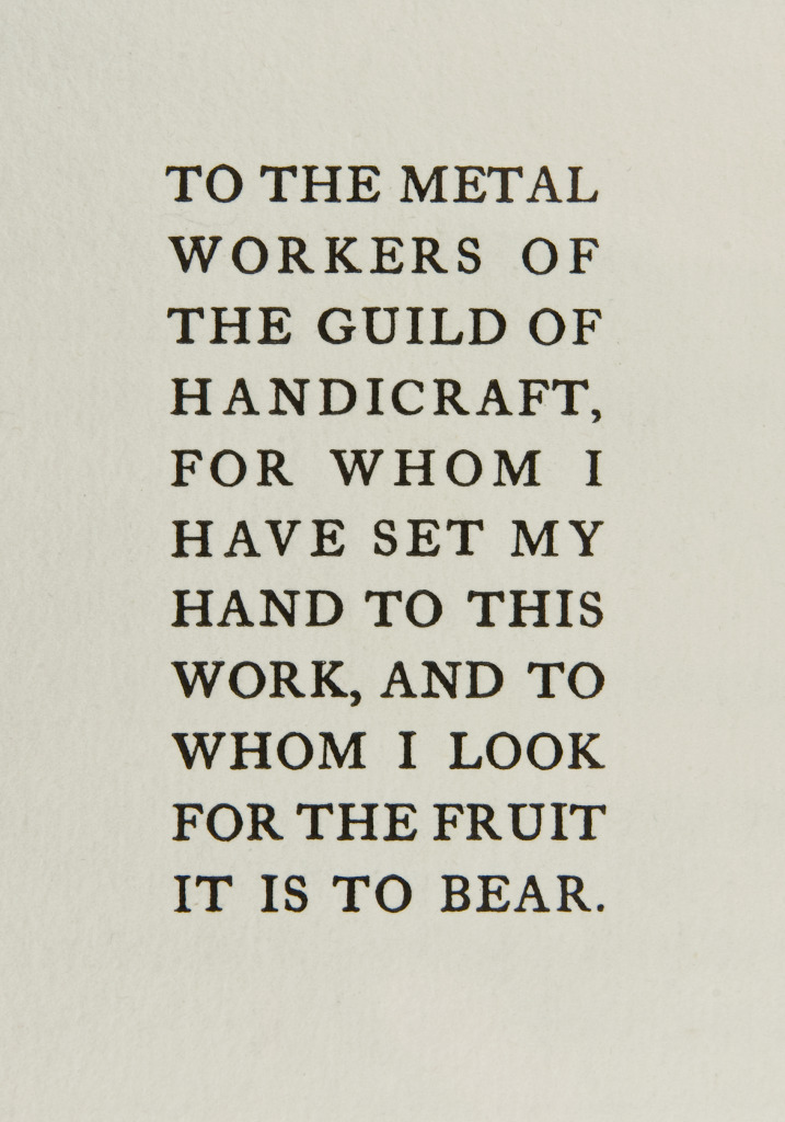
C. R. Ashbee’s private printing venture, the Essex House Press, was conceived as a total work of art. The choice of texts, materials, typography, and decoration were all integral to its identity. In keeping with the ideals of the Arts and Crafts movement, books were printed by hand using letterpress techniques on handmade paper or vellum. Fine printing, as Ashbee understood it, demanded that every element of the book, not only its text, be raised to the level of art. Typography was therefore central to the press’s aesthetic programme.
When Ashbee acquired William Morris’s Albion presses, he did not inherit Morris’s typefaces. Instead, he purchased several fonts of Caslon Old Face, primarily in 14-point for body text, with 24-point capitals for chapter headings in larger volumes. This was a deliberate and sympathetic choice for a printer aligned with Arts and Crafts principles. At the same time, Ashbee announced his intention to design original typefaces of his own.
Endeavour and Prayer Book Typefaces
Ashbee’s first original typeface, Endeavour, was designed in 1901 and named after An Endeavour Towards the Teaching of Ruskin and Morris, published by the Essex House Press that same year. The font was a complete 12-point Roman distinguished by an unusually large number of ligatures, a characteristic reminiscent of early printing practices and likely intended to evoke them.
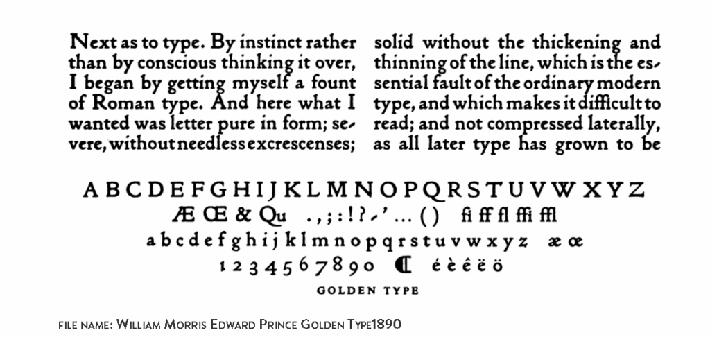
In 1903, Ashbee introduced a second typeface, Prayer Book, first used in the Prayer Book of Edward VII. Designed in 18-point, it was a development of Endeavour, with some of its more eccentric features moderated. The letters remain heavy and high-contrast, employ numerous ligatures, and print as a dense, black presence on the page. Their more cursive qualities suggest an affinity with Art Nouveau. Both Endeavour and Prayer Book ultimately derive from William Morris’s Golden Type.
Ornament and Critical Reception
Critical responses to Ashbee’s typography have been mixed. Writing in The Private Presses (1969), Colin Franklin observed that by the mid-twentieth century “nobody … had many good words to say for” Ashbee’s types, which were often dismissed as “bizarre.” Franklin, however, argued that such judgments were unduly harsh, suggesting that Ashbee’s Art Nouveau lettering was true to his sense of form and remains appealing today for its distinctly turn-of-the-century character.
John Russell Taylor, in The Art Nouveau Book in Britain (1979), similarly praised the Essex House Press while acknowledging its limitations. He noted that Ashbee was “the only” figure to sustain Emery Walker’s ideal of the decorated book, in which all elements contribute to a harmonious whole. Taylor found the typefaces “rather oppressive” in extended prose, but “firm and magnificent” in the Prayer Book and the Psalter.
It is worth noting that Ashbee required nearly eight years to achieve a mature and restrained style in his furniture and metalwork. His ambition to master typography in just two years was therefore remarkably bold and, by many measures, a considerable achievement.